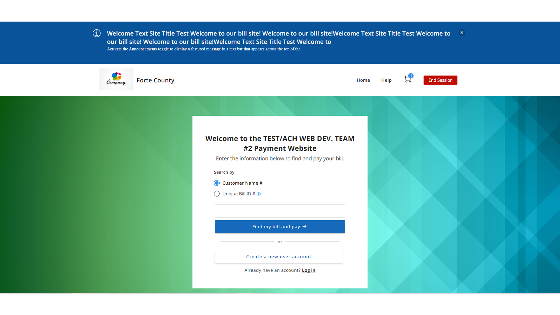
ENHANCED BILLPAY PORTAL HOME PAGE
New Feature / Improvements:
A refreshed BillPay Portal Home Page is now available for you and your customers.
NEW FEATURE / IMPROVEMENTS:
*IMPROVEMENT* BILLPAY PORTAL home page is modernized
The revamped BillPay Portal Home Page offers a seamless and user-friendly experience across desktop and mobile platforms, ensuring a satisfying journey for all users.
What is changing?
- Main calls to action are highlighted: We are rearranging the content to call out main calls to action. So, your customers can clearly see the steps they need to take on the Payment Portal, which simplifies the process, increasing payment success.
- Look and feel is now updated: We’re keeping key elements, enhancing accessibility, modernizing the page, and including major improvements for mobile devices (fewer steps and clear interphase), which aids in improving the overall user experience. Please note that most Home Page elements follow your current Portal’s setup.
- Portal features are customized based on your choices: This means the new Home Page changes based on your Portal Mode.
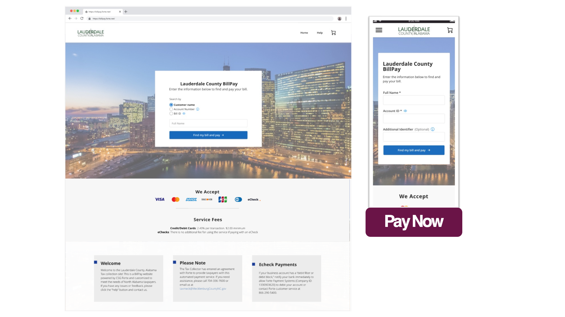
So, if you support Pay Now only, search fields are now embedded on the Home Page. Hence, your customers can promptly search for their bills and pay them easily.
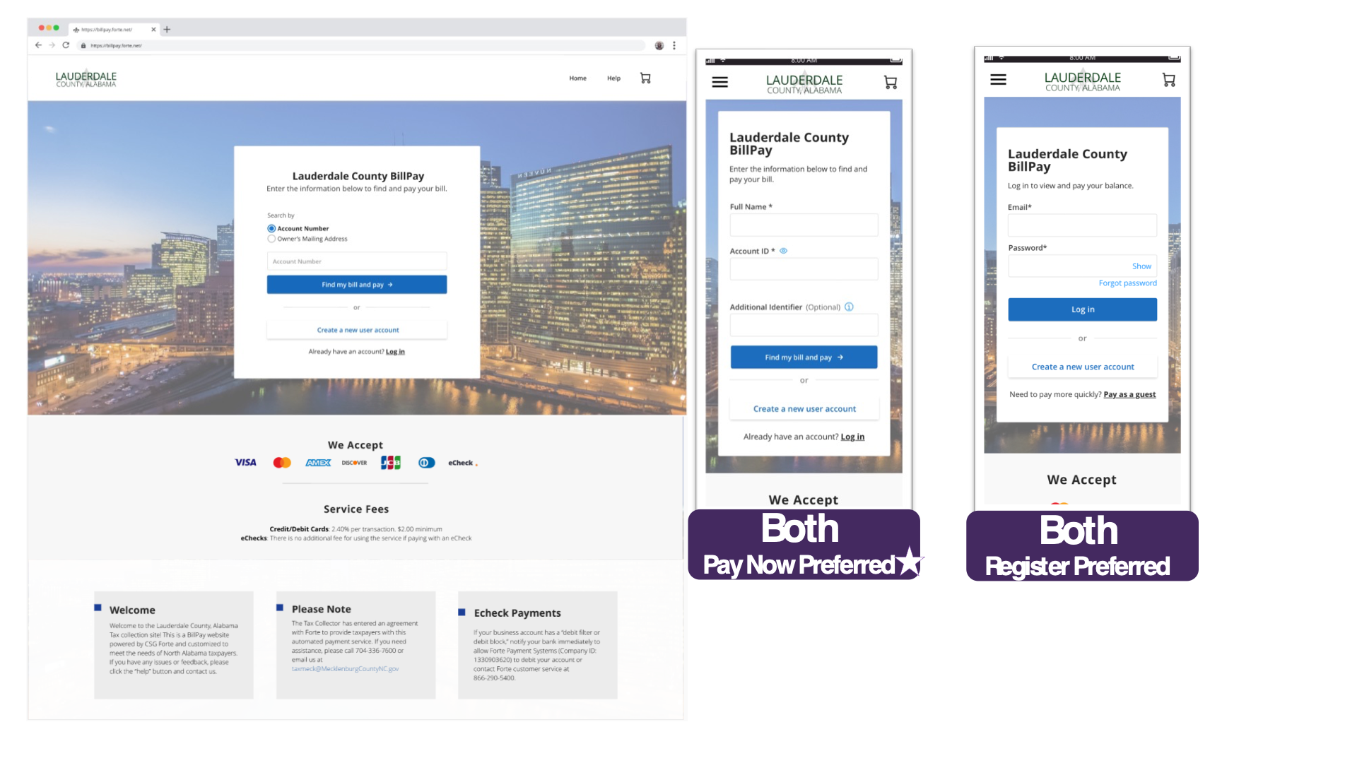
And if you are supporting both options, you can choose to highlight either Pay Now or Login. In this case, the search fields are now embedded on the Home Page by default. To highlight the login instead or any other request, reach out to your main Forte contact or Add a ticket to our web page using this link and include the request as ‘BillPay Portal Home Page’.
Enhanced Home Page screens:
- Mode: Pay Now only
- Mode: Both (Pay Now + Register)
If you allow both modes (Pay Now and Register), PayNow is the default option.
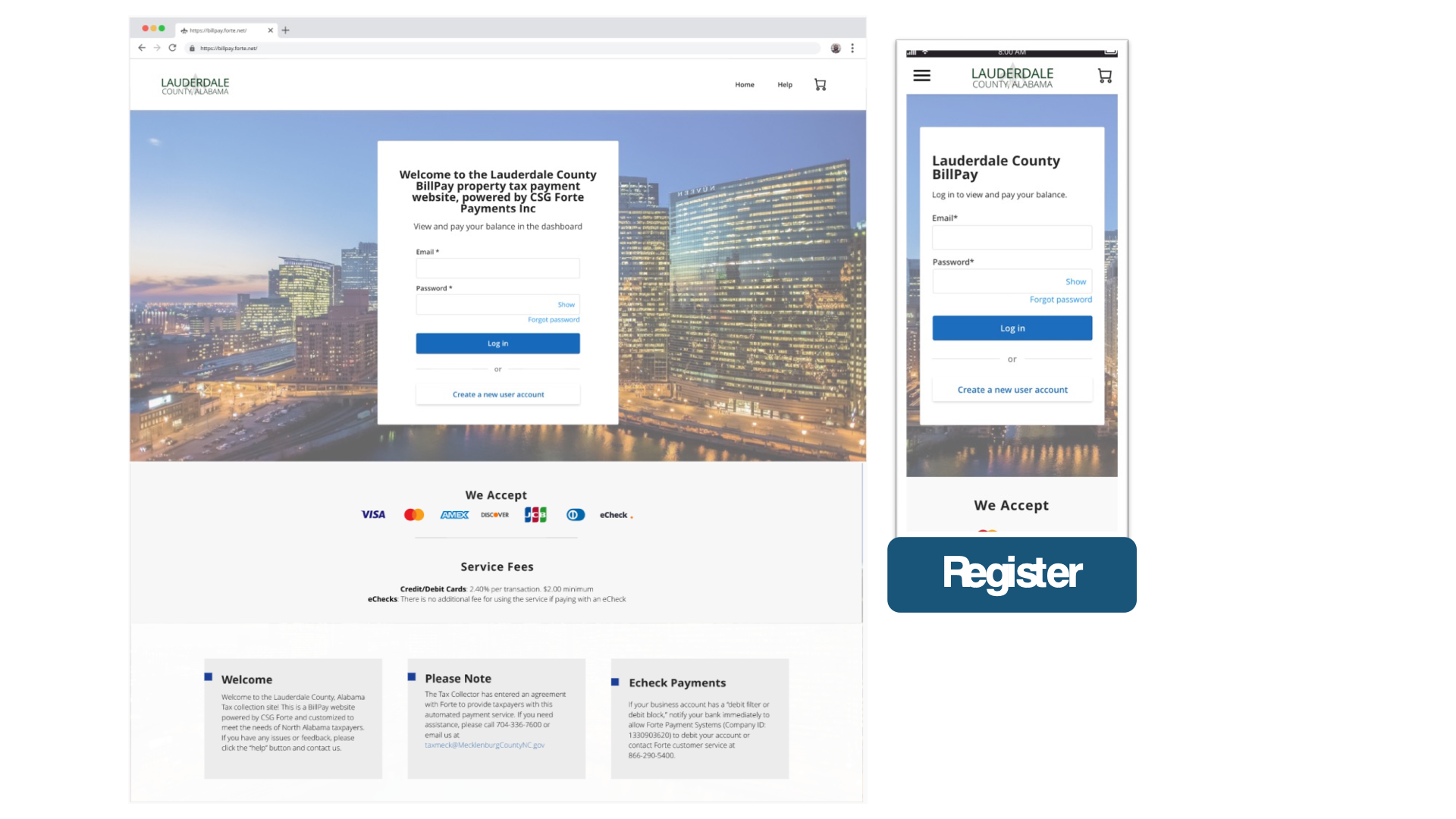
- Mode: Register only
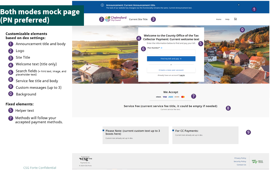
Detailed list of Home Page elements:
Please note that most Home Page elements follow your current Portal configuration.
Kiosk mode


